Helping researchers navigate complex information
The challenge
As Meta Content Library evolved beyond a simple archive into a research platform, key workflows became difficult to discover and manage. Researchers struggled to understand available capabilities, keep track of complex searches, and efficiently navigate the product.
Opportunity
Rather than adding more guidance or documentation, I focused on reducing the mental effort required to understand the system itself.
Orienting researchers
We redesigned the homepage to support both first-time users and returning power users by making the tool welcoming and providing relevant information.
Original homepage
The initial version of the homepage functioned primarily as a search tool.
Users landed on a sparse interface with few clues about what the product could do, who it was for, where to start, or what had changed since their last visit.
The experience assumed users already understood the product and its capabilities.
Why this needed updating
The homepage wasn't serving as a proper homepage at all. Instead it was functioning as a blank entry point.
As Meta Content Library evolved, it gained new capabilities and workflows, but the homepage provided little context about what the platform could do or where researchers should begin.
Redesign goals
Helping new users understand the platform's capabilities
Providing returning researchers with fast access to common workflows
Increasing discoverability of newly launched features
To support these goals, I introduced audience-specific homepage experiences, surfaced key workflows and tools, and created clearer pathways into advanced functionality. The result was a homepage that not only enabled search, but also helped researchers understand and navigate a growing research platform.
Homepage updates
Researchers arrived with very different goals. New users needed help understanding the product's capabilities, while returning users wanted fast access to their workflows. The homepage needed to introduce unfamiliar functionality without slowing down experienced researchers. To balance those needs, we prioritized educational content for first-time visitors while providing direct access to commonly used actions for returning users.
Updated new user homepage
The redesigned new user homepage communicates value immediately.
It features sections that:
explain core capabilities
highlight key workflows
expose important tools
reduce uncertainty by providing a clear path forward
Through this content, the homepage demonstrates what Meta Content Library can help researchers accomplish.
Updated returning user homepage
The updated homepage for returning users helps researchers who are already familiar with the product quickly access the workflows they need. Adding too much content risked overwhelming users who came to the product for efficiency, so I focused on exposing high-value functionality while maintaining a clear path into search.
The homepage now served as a product hub rather than just a utility screen.
As Content Library expanded to include additional features and research capabilities, the homepage became an important mechanism for introducing new functionality and helping researchers understand how the platform was evolving.
Improving filter functionality
Researchers often work with highly specific combinations of filters. In the original experience, applied filters could truncate, making it difficult to understand the current search state. Important actions like saving, sharing, or clearing a search were also difficult to find.
We updated the interface to help researchers understand their current search configuration at a glance.
Original filter design
The initial version of the filters provided basic functionality, but presented several challenges as well:
It was difficult for users to understand what they had selected due to the way the filters truncated.
There was no way to easily clear filters, so researchers need to manually re-set each filter to clear them.
While there were options to save and share searches, these were difficult to find.
Updated filter design
In the updated design, the filter chips are expanded with the selections visible so researchers no longer need to open filters repeatedly to verify what they're searching for. We also added icons to the filter buttons to make the filters easier to identify at a glance
This allows researchers to keep track of the filters they’ve applied when viewing results, improving functionality and efficiency.
Search management actions
Once researchers understand their search state, they need efficient ways to manage it.
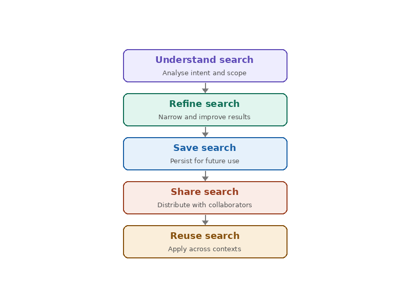
In addition to improving the filters, we also made updates to aid researchers at each stage of their search workflow:
Added a clear all button next to filters to help users easily remove their filter selections.
Moved save search and share search buttons next to the main search bar to expose them as available actions.
Overall improved search experience
Rather than addressing each usability issue independently, I focused on reducing the amount of information researchers needed to hold in memory while conducting searches. The redesign made search state, available actions, and workflow controls visible within a single scan of the interface.
These updates contributed to Meta Content Library achieving a 75%+ user satisfaction rating based on surveys.