Personalized AP dashboards
Strategic product vision
The problem
The solution
My role
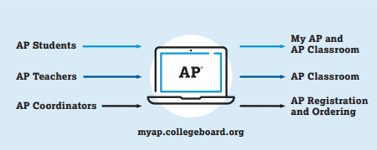
Students, teachers, and coordinators (who handle exam ordering and administration) struggled to navigate disconnected tools like the Advanced Placement (AP) program’s informational websites, online classroom support tools, and exam registration and ordering platforms.
A personalized one-stop dashboard that elevates timely content, key actions, and critical deadlines based on the user's specific profile and the time of year. This dashboard (called My AP) aims to streamline the user experience by serving as a centralized access point for AP tools and applications, pulling high-level data from other platforms for easy access.
Project Lead, responsible for overseeing execution, prioritizing work, and ensuring the product met business objectives.
Designs for multiple user groups
I had to think about a diverse user base with varying needs when designing this product. We built universal features (including banner notices for important dates and an improved notification system to reduce email reliance) as well as audience-specific content.
Teachers
Students
Coordinators
Administrators
Course data, student enrollment, assignment statuses, and performance dashboards
Course and exam registration status, assignment aggregates, and personal profile information
Operational deadlines, ordering status, and system module progress
School or district-specific course data, usage metrics, and exam administration timelines
AP resources
The dashboard needed to pull in information from other key AP tools and provide links to the products each audience used the most, with the goal of making it easier for users to navigate the AP ecosystem.
User-centered research and testing
Participants
Methodology
Insights
Iterative refinement
I conducted 20 qualitative interviews across schools to uncover motivations and pain points of students, teachers, and administrators.
I showed users prototypes and asked them to describe their impressions and narrate their experience. They shared their expectations and then discussed if the prototype met these or not. Each user also reviewed three different design options and selected their preferred version.
The general structure aligned with users’ mental models, but some of the design elements meant to help draw focus caused confusion.
Based on the user feedback, we refined the design, landing on a version with a more detailed outline of course details and prominent links to additional resources customized by audience.
UX audit and workflow analysis
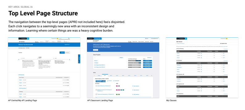
I conducted an audit of how the personalized dashboard would connect to existing AP resources based on initial designs and identified main areas requiring upgrades.
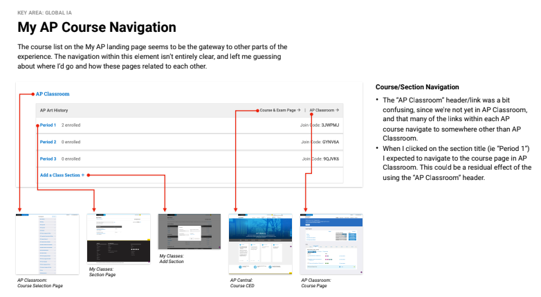
Samples from the audit, showing the page by page analysis
Navigation
The navigation between felt disjointed and inconsistent, placing a heavy cognitive burden on users.
Data access
Accessing student and class-level data was difficult and scattered across different areas, complicating the goal of easily gauging student progress.
Joining classes
Students identified a particular pain point around the flow for joining class sections, frequently encountering blockers during this process.
Suggested improvements
Recommendations for next steps included addressing small design and copy fixes in the short term, followed by implementing larger UX fixes.
Updated educator dashboards
We optimized the experience for both teachers and coordinators by centralizing critical data and timely tasks. This one-stop shop experience consolidated disparate platforms into a unified interface that delivers content and notifications based on the user's specific profile and the time of year.
Updated AP teacher dashboard
Updates for teachers
The teacher experience is focused on instructional support and streamlining classroom management tasks:
Instructional resources: Teachers now have direct links to Course and Exam Descriptions (CEDs), AP Central Course and Exam Pages, and Units at a Glance to assist with course planning.
AP Classroom integration: A new Preview tile on the hub elevates actionable data from AP Classroom, including the number of submitted assignments and those ready for teacher scoring.
Performance tracking: The hub features a link to the Performance Dashboard, which includes visualizations indicating results trends (up, down, or steady).
Class management: Teachers can view their class sections, monitor how many students have enrolled, and access Join Codes directly.
Operational support: The personalized timeline highlights course-specific deadlines and operational milestones like exam registration and score releases.
Updated AP coordinator dashboard
Updates for AP coordinators
For coordinators, the updates prioritize operational efficiency and administrative oversight:
Streamlined registration and ordering: The hub pulls in critical data from the AP Registration and Ordering (APRO) system, including the total number of student and exam registrations and current cost views.
Task management: Coordinators can view their order status and next steps directly from the dashboard.
Organizational flexibility: For those managing multiple institutions, a toggle feature allows for easy switching between different organizations.
Engagement monitoring: Coordinators have access to usage data for both teachers and students, alongside links to the Performance Dashboard for school-level trend analysis.
Operational timeline: A centralized calendar tracks operational deadlines from APRO, self-generated decision deadlines, and important dates for exam preparation and administration.
Updated student dashboards
We prioritized a seamless, brand-consistent experience for students. The core objective was to transform the fragmented student web experience into a mobile-friendly, personalized hub that provides clear pathways to critical resources.
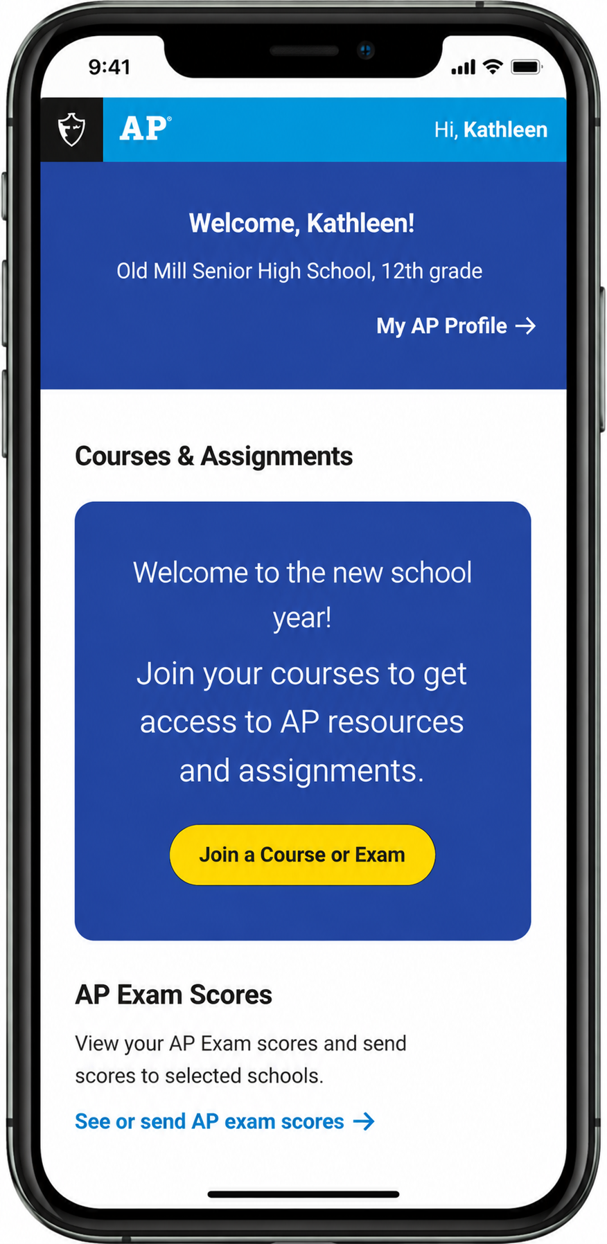
Initial screen: Welcome for students with links to key tasks and tools
Mobile-responsive design: A primary focus was ensuring the student site was fully mobile-friendly, which previous sites were not despite mobile traffic being significantly higher than web traffic for students.
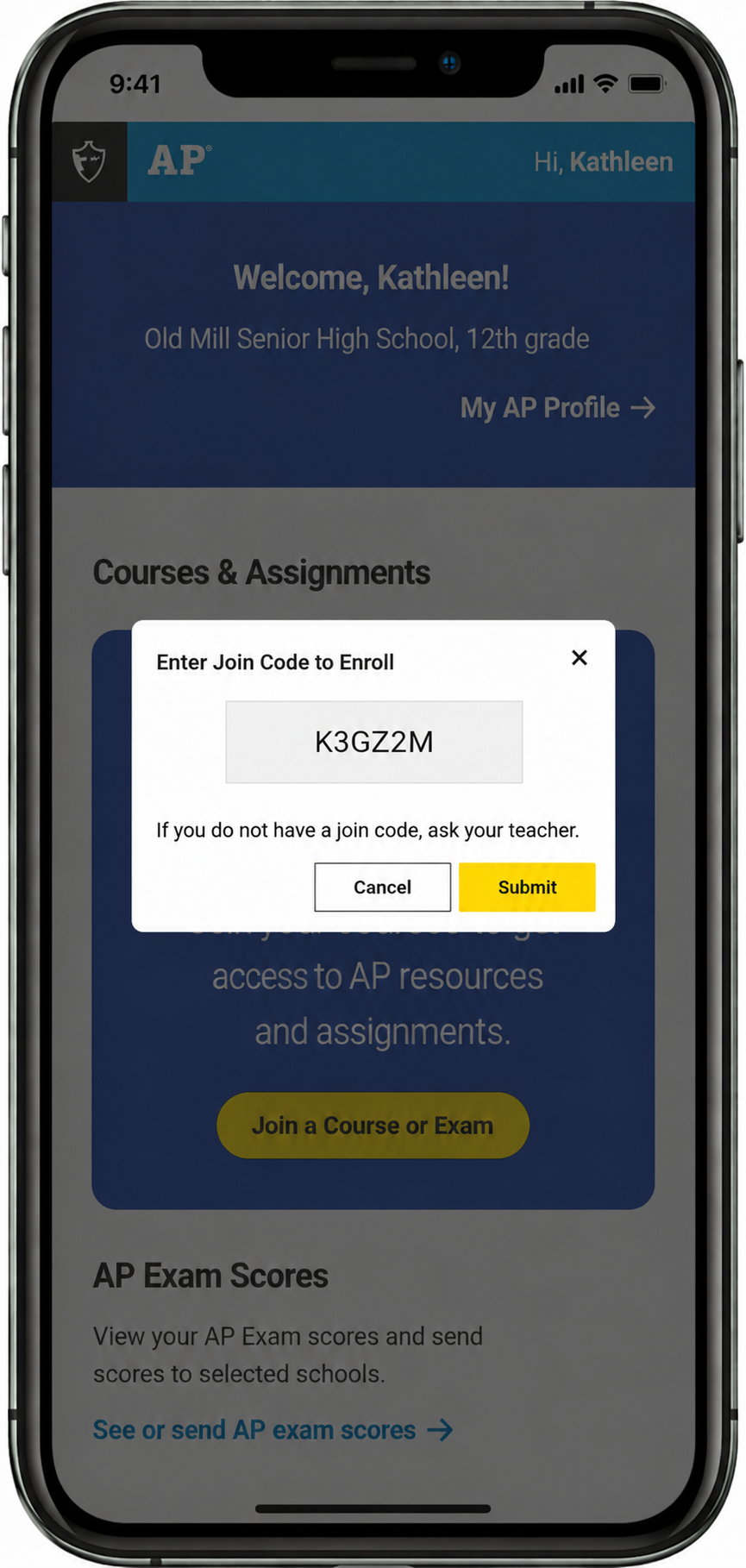
Join code interstitial: Entry point for codes provided by teachers
Core functional and digital updates
Personalized student hub: Students receive a one-page personalized dashboard that pulls in high-level data from other platforms, such as AP Classroom, to provide timely content based on their profile.
AP Classroom resources
AP Daily Videos: Students can view assigned instructional videos directly.
Personal Progress Checks: Students can view assigned checks, complete them, and review their results to track mastery.
Unit and topic questions: Access to practice questions linked to specific course topics.
Streamlined navigation: The information architecture was restructured to reduce endless cascades of links and loops. The goal was to increase findability for key tasks like joining courses or viewing scores.
Resource and content integration
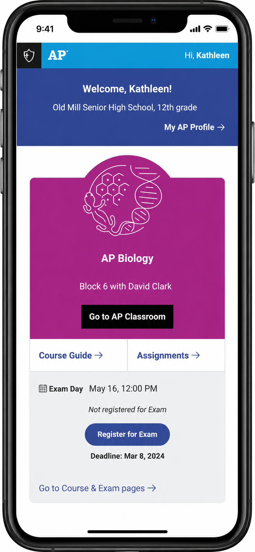
Hub with course joined: Course and exam details with access to resources
The updated student experience centralizes several key instructional and operational tools:
Brand consistency: The front-end UI was updated to be on-brand with educator-facing sites and the broader College Board ecosystem.
Exam and course specifics
Course articulations: Rearchitected pages reflect new course units and skills.
Exam preparation: Centralized access to released free-response questions and sample scoring commentary.
Score reporting: Clearer on-ramps to the Online Score Reporting System.
Communication and engagement
Banners and notifications: Important deadlines or universally significant dates are communicated via banners to reduce the reliance on email, which students are less likely to read.
Feedback loops: Embedded questions allow students to share their feelings about AP exams or site utility directly within the interface, rather than through separate survey pop-ups.
Timeline of actions: A dynamic timeline helps students track operational deadlines, such as exam registration, unit assessments, and score release dates.
Key results and impact
The My AP hub launch was defined by its ability to resolve complex logistical hurdles while maintaining a high level of user satisfaction.
Platform consolidation and efficiency
High user satisfaction
Reduced cognitive load
Successfully unified disparate tools into a single source of truth, enabling students and educators to access assignments and progress tracking with a single login.
User testing revealed high satisfaction scores (averaging 4.5 out of 5) for critical workflows.
Teachers in particular noted the value of the simple design, which streamlined key classroom management tasks.