Viewpoints AI data collection
Increasing participation in AI training programs
To improve Meta's AI products, we needed people to contribute data through research programs hosted in Meta Viewpoints. My challenge was designing content that helped users understand unfamiliar AI data collection opportunities, trust how their information would be used, and stay motivated through multi-step participation flows.
By focusing on clear value communication, transparent participation requirements, and sustained motivation throughout the experience, the programs achieved rapid adoption shortly after launch.
Encouraging discovery
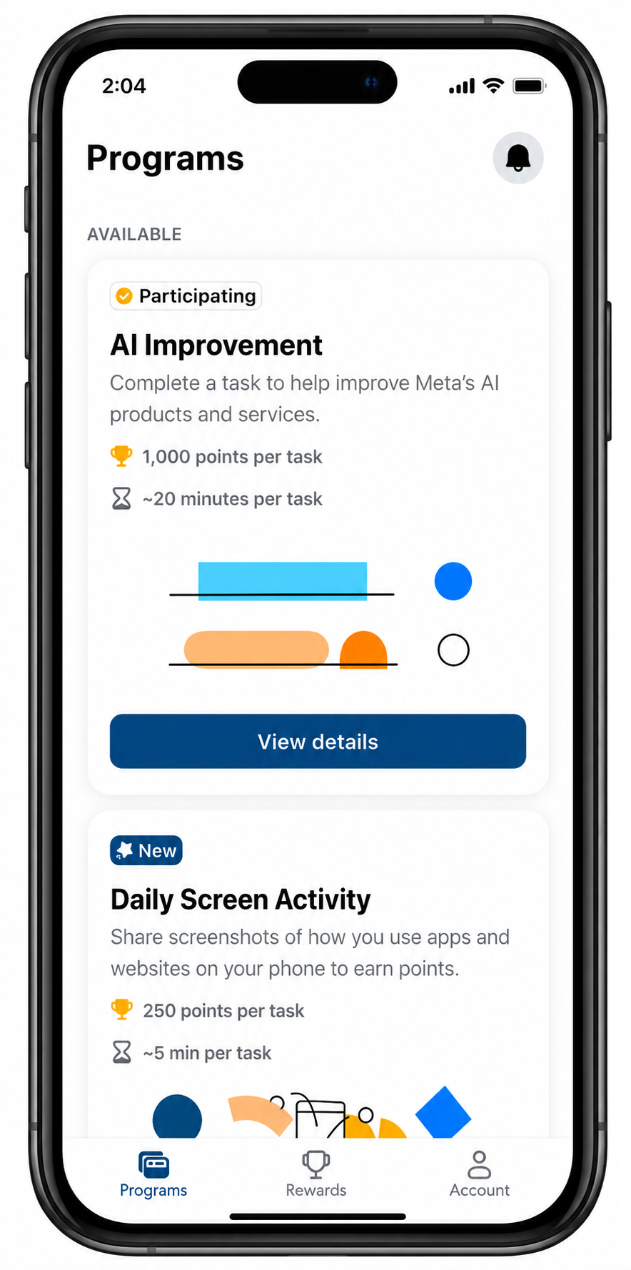
Users arrived in Viewpoints primarily because they wanted to earn rewards, not because they were actively looking for AI data collection opportunities.
The challenge was: How do we generate interest in an unfamiliar AI-related program using only a small amount of screen real estate?
I treated program cards like promotional surfaces. Instead of leading with task details, Rather than overwhelming users with task details, I prioritized communicating the reward and creating enough interest for users to explore further.
As user participation in Viewpoints is largely incentive-driven, this placement wasn't decorative. It directly aligned with the mental model users already had for the platform.
Building trust through transparency
AI data collection can feel opaque. Users may wonder what they're contributing, how their data will be used, what they're agreeing to, and how rewards are earned. While it was important to explain the task, I also needed to create enough clarity and transparency for users to feel comfortable participating.
I used the Program overview screen to help users make informed decisions. This screen had to do a lot at once: reduce uncertainty, set expectations, clarify requirements, and explain participation. Along with all of this, I needed to translate legal and policy language into something users could actually understand and act on. Because the program involved both data collection and compensation, I worked closely with legal and product partners to determine what information participants needed at each stage.
The central design decisions were around sequencing: What did users need to know before enrolling, and what could wait?
Sustaining motivation through completion
After users enrolled, I needed to ensure they followed through and completed the tasks. Participants needed to join, understand what counts as a valid submission, leave the app, complete work elsewhere, and return. Every additional step was a potential drop-off point.
Confirmation screen
The confirmation screen lets users know they’ve successfully signed up. Its more important job is to reinforce the user’s commitment to participating in the program and guide them to get started with tasks.
Completion banner
The completion banner closes a loop that many products leave open. Beyond confirming the task was done, it surfaced a sense of accomplishment and made progress visible, showing participants how far they'd come and keeping motivation intact for what's next.
Instructions
The task required leaving the Viewpoints app and completing work on a third-party platform. This transition introduced friction and uncertainty. Clear instructions at this handoff point ensured participants knew exactly what to do and how to do it successfully.
Rewards page
The rewards messaging is more than just an informational summary. Its job is to remind users why continued participation is worth their time and effort.
Results
We signed up more than 1,000 participants within less than 24 hours of launching the AI Improvement programs.
Creating an ongoing participation cycle
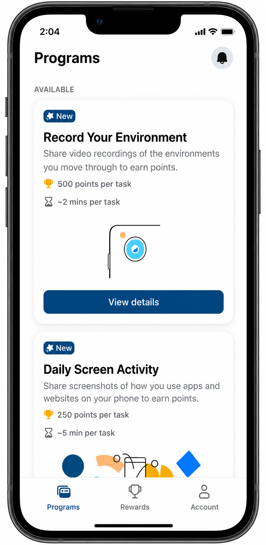
Since Viewpoints contains a variety of programs users can participate in, we didn’t just want them to complete this the AI improvement tasks and leave. We wanted this to serve as an entry point to the next set of tasks. Rather than designing for a single program, I looked for opportunities to encourage continued participation by making progress and available opportunities visible throughout the product. New program badges, the rewards page, and points balance all serve this function: keeping users oriented, motivated, and ready to engage again.